Django18初体验
2495 浏览 7 years, 7 months
22 bootstrap网格系统
版权声明: 转载请注明出处 http://www.codingsoho.com/http://getbootstrap.com/css/#grid
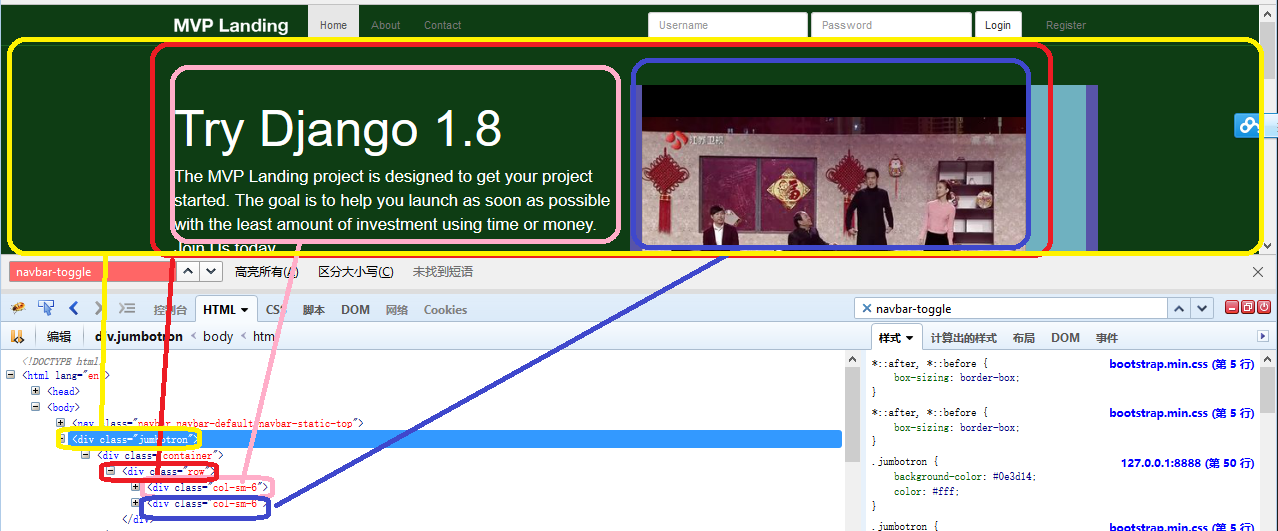
Class “container-fluid” 全屏
<div class="container"> 这个只显示中间部分,宽度不会全屏
Introduction
Grid systems are used for creating page layouts through a series of rows and columns that house your content. Here's how the Bootstrap grid system works:
• Rows must be placed within a .container (fixed-width) or .container-fluid (full-width) for proper alignment and padding.
• Use rows to create horizontal groups of columns.
• Content should be placed within columns, and only columns may be immediate children of rows.
• Predefined grid classes like .row and .col-xs-4 are available for quickly making grid layouts. Less mixins can also be used for more semantic layouts.
• Columns create gutters (gaps between column content) via padding. That padding is offset in rows for the first and last column via negative margin on .rows.
• The negative margin is why the examples below are outdented. It's so that content within grid columns is lined up with non-grid content.
• Grid columns are created by specifying the number of twelve available columns you wish to span. For example, three equal columns would use three .col-xs-4.
• If more than 12 columns are placed within a single row, each group of extra columns will, as one unit, wrap onto a new line.
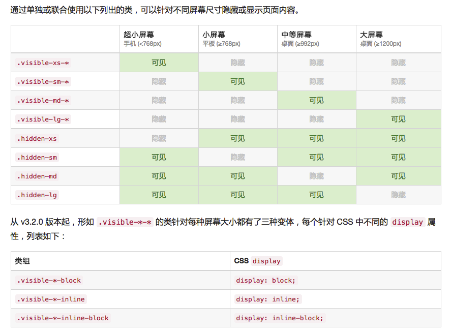
• Grid classes apply to devices with screen widths greater than or equal to the breakpoint sizes, and override grid classes targeted at smaller devices. Therefore, e.g. applying any .col-md-* class to an element will not only affect its styling on medium devices but also on large devices if a .col-lg-* class is not present.
Tips
如果想要固定宽度fixed, 使用 col-xs-???, 否则当屏幕变得更小级别时,它会变成全屏.
例如,如果你使用col-sm-3, 在smal size或者更大宽度显示时,它会显示1/4(3/12)屏幕宽度, 但是如果转到xsmall屏幕时,它将会100%显示.