There’s been some discussion around the iPad’s multitasking user interface, i.e., “how to do several things at once on an iPad?”. The general feeling is that the current UI is clumsy, hardly discoverable; that’s what makes the iPad a consumer device, and not a machine to be used for actual work.
I tend to agree, but I don’t think the current state of the Mac user interface is much better. Let’s review the Multitastking UI on Apple platforms.
iOS
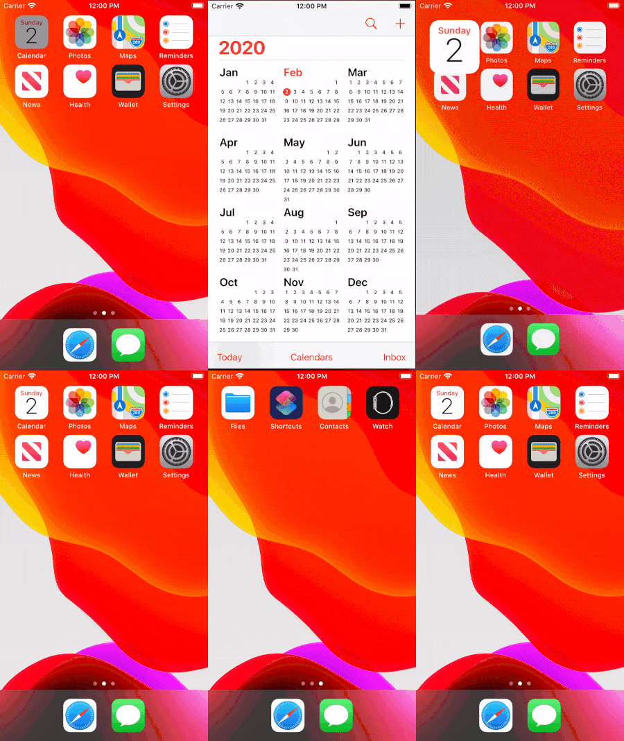
The multitasking UI on iOS is a Zooming User Interface. Tapping an icon zooms into it and the app fills all the screen space, then you can pan to neighbouring apps. On iOS, the screen of the device is actually a window through which we interact with a larger space.1

Another design metaphor had been crucial on iOS, since iOS 7: the interface is made of layers. The Control Center, for example, appears as a layer above the Springboard or the current app. When Apple design documents refer to depth and translucency, this is what it is about.

The iOS user interface is a 2.5D virtual space, made of flat translucent panels, where you can zoom, pan, and move panels in front of others. This is similar to the multiplane camera used in traditional animation.

This design paradigm works really well on iPhone, where only one app is used at a time.
On iPad, several apps are on screen at the same time and things get a little more complicated. Slide Over still makes sense: one apps floats in a layer above the rest.
But in Split Screen, the layers metaphor breaks: both apps are on the frontmost layer.
This brings two major design issues:
- Even if two apps appear frontmost, this is a fallacy: only one actually receives keyboard input.
- Opening an app on iOS is easy: tap it, and it takes the full screen. But this doesn’t work for multitasking: specific gestures are needed to invoke these modes. A proper iPad OS will require a new interaction design.
macOS
The Mac traditional UI is the Desktop; modern macOS is a lot more. Here’s a partial list of multitasking interactions on macOS:
- Click an app window to move it to the front;
- Double-click the app icon in the Applications folder;
- Click an app icon in the Dock;
- Minimize a window into the Dock;
- Swipe three fingers up to lay out all the windows side by side (Exposé);
- Swipe three fingers left or right to switch to another Space;
- Make a window full-screen in its own Space;
- Make two windows split-screen in the same Space;
- Enter Mission Control to move windows to Spaces and switch to a Space;
- Pinch four fingers to enter LaunchPad and click an app;
- Open Spotlight and type the app name;
- Last but not least, hit Command-Tab to switch to another app and move its windows to the front.
The classic Desktop metaphor is simple: each window is a paper sheet on a physical desktop: you can stack sheets, move them around, or put them side-by-side.
The Dock, that originated in NeXTSTEP, is more abstract; in a way, it’s just an ever-present list of app and file icons.
The more modern features, Mission Control and LaunchPad, use a virtual space model, like in iOS: the screen is a camera that pans laterally.
Unfortunately, when it comes to switching apps, these models each have their own behavior:
- In the Command-Tab app switcher, only the launched apps are visible; the active app is first, and then they’re ordered from most recently used to least.
- In the Dock, app icons appear in their launch order, and stay in that order unless manually reordered. In that case, app icons remain in place even when the app is quit.
- In Mission Control, Spaces with full-screen apps are automatically reordered when each app is activated; this can disabled and Spaces can be manually rearranged.
- Finally, the icon order and the folders in LaunchPad don’t match the contents of Applications folder, and are also distinct from the ordering of the pinned apps in the Dock.
When working with several apps, we often switch between three or four apps. The fact that the icons and windows reorder themselves in different ways is a big cognitive load: we can’t build a mental map of the virtual space.
I wish macOS stopped mixing metaphors. Maybe fortunately, switching between native apps is becoming irrelevant.
The future is the web (as usual)
The real multitasking in modern computing is in the tabs of the browser window. I hit Ctrl-Tab even more often than Cmd-Tab. In fact, in Safari, the Tabs Preview is like a small, app-specific Mission Control.

We need a simpler, unified model. I don’t have one: if you listen to me, we’ll go back to a strict Desktop system. Maybe let’s stop thinking in terms of “apps”, and start saying multi-context instead of multitask.
from: https://bou.io/multitasking-user-interface.html

